A one home page redesign requested from a development company for their client, Akademi Dalam Industri.
Akademi Dalam Industri (ADI) is a national initiative powered by the Malaysian government to nurture local talent through real industry experience, skill development and employment pathways. However, the existing website struggled to deliver a clear message and guide users toward meaningful action.
This redesign focuses on creating a modern, clean, structured and user-centric platform that can better support ADI’s mission — helping Malaysians learn, grow and access real career opportunities.
The original website lacked clarity and direction. Users struggled to find relevant information, the content was dense and unstructured, and navigation did not support different audience needs. With weak CTAs and an outdated visual experience, the site failed to engage, guide, or convert effectively.
I restructured the experience around clarity and flow, beginning with a cleaner sitemap and user paths for each audience group. The content was simplified into scannable sections, supported by guided layouts and purposeful CTAs.
For visual design, I introduced a modern layout with stronger rhythm which also requested and aligned by the stakeholder, consistent spacing, and clearer CTAs to guide action. The refreshed color usage and typography improved readability and added trust, while supportive visuals helped communicate purpose without overwhelming users.
A modern visual direction was then applied to build trust, improve readability, and help users understand what to do next.
After
Before

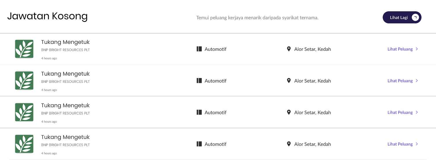
New Vacancy hub that connects users to real job openings, helping them take immediate action after exploring programs.
Clear audience pathways with tailored benefits and guided signup, so each user sees relevant value from the start.
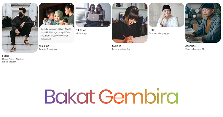
A dedicated testimonial section that builds trust and human connection through real voices and success stories.
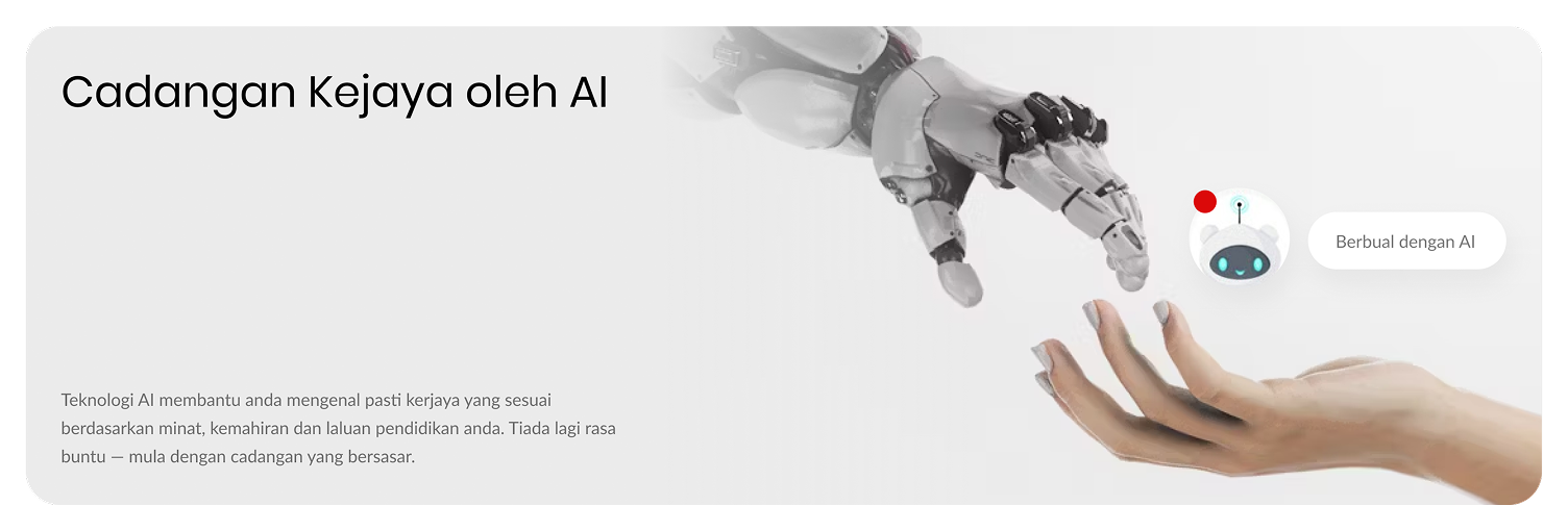
An integrated AI assistant to answer questions instantly, reduce friction, and guide users with personalised support.

A stronger footer experience with clearer utility links and app download access, turning the footer into a functional action zone.
The redesign made the experience easier to navigate and faster to understand. With clearer messaging, structured content, and stronger CTAs, users could now move from awareness to action with confidence.
The improved clarity, trust, and flow provide a stronger foundation for ADI to promote national talent development.
By simplifying information and building purposeful flow, even a government platform can feel approachable and human. It also reminded me that good UI is not just about visuals,
it's about guiding decisions, reducing friction, and helping users move forward with confidence.