Take It Home campaign was a series of listening events by helping the business to drive brand awareness and engagement with KEF. Simultaneously, it is also helping the potential customers/fans experience KEF’s speakers where it matters most — in their own home, in iconic cities around the world.
Since this was a brand-new campaign with no prior reference or similar event pages, I had to approach the layout from scratch. Project owner wanted something bolder and less conventional than KEF's usual style, instead,
a design that could spark interest, create curiosity, and drive registrations through a fresh, engaging look while still staying aligned with KEF’s premium image.
I started by understanding the campaign brief. As this was a new campaign for KEF, I also looked into how other brands approached similar campaigns or events, gathering layout and flow references to inform my direction. From there, I broke the user journey into digestible sections, prioritized clarity in copy and structure, and leaned into calm, open visuals that let the story breathe.
I aimed for a layout that was clean yet bold, informative but light, something that could capture attention and guide users through the idea with ease, ending in a clear call to action.
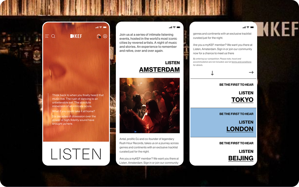
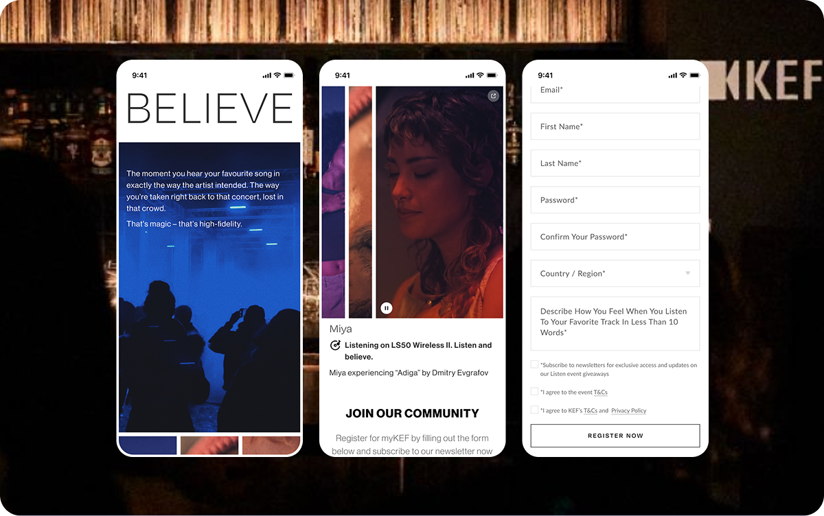
Clean, bold, and typography-driven editorial design style to instantly grab user’s attention while maintaining a sense of clarity and rhythm. Large type, high contrast, and white space were used to break down the content into breathable, and engaging chunks.
Each ‘Listen’ city is given its own spotlight with strong individual color-strap and date-driven structure, reinforcing the idea of exclusivity and anticipation. The dynamic use of different accent colors per city adds localized character while keeping the overall layout in consistent.

The ‘Sign up to myKEF’ CTA is placed after the event detail to catch users at the moment of peak interest. Rather than pushing it too early, the design builds anticipation through emotional visuals and storytelling, then offers a clear action when the user is most informed and engaged. Then, let the CTA lead them into the form below to fill up and proceed to register.
This approach makes the user feel like they’re stepping into something exclusive, rather than being “sold” something, which aligns with the campaign’s experience-first philosophy.
This approach makes the user feel like they’re stepping into something exclusive, rather than being “sold” something, which aligns with the campaign’s experience-first philosophy.
‘Listen’ and ‘Believe’ section.
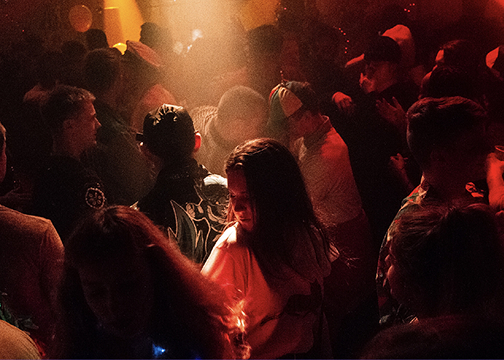
The ‘Listen’, aims to reach key peoples in the industry at local ‘Listen’ event in person. The ‘Believe’, shows the emotional connection to music and sound through ‘Believe’ video and stills
The ‘Listen’, aims to reach key peoples in the industry at local ‘Listen’ event in person. The ‘Believe’, shows the emotional connection to music and sound through ‘Believe’ video and stills
‘Explore’ section, newly added after the events was successfully held.
The ‘Explore’, highlighting the past Listen events, and inviting users to relive the magic of high-fidelity sound through storytelling.
The ‘Explore’, highlighting the past Listen events, and inviting users to relive the magic of high-fidelity sound through storytelling.
The page was launched across the 14 regions and rolled out in multiple languages. Feedback from internal teams was positive, the design felt consistent with our branding, and the campaign structure made it easy for users to take action. While the analytics show the campaign page had drove a large numbers of traffic throughout the campaign period.
5
Total Listening Events
107,377+
Total Campaign Page Traffic
The campaign continued to run for several months in different cities, suggesting a stronger performance. The page was also continued to touch-up, enhance according to the different listening city’s requirements and experiences.