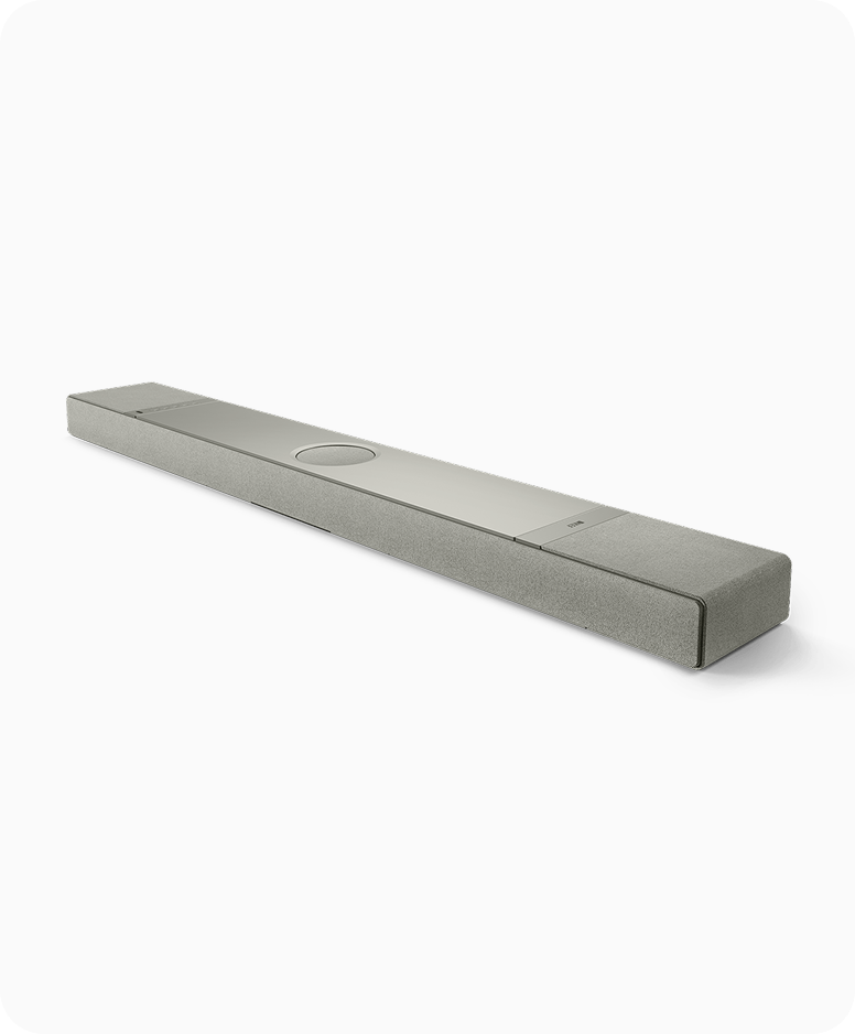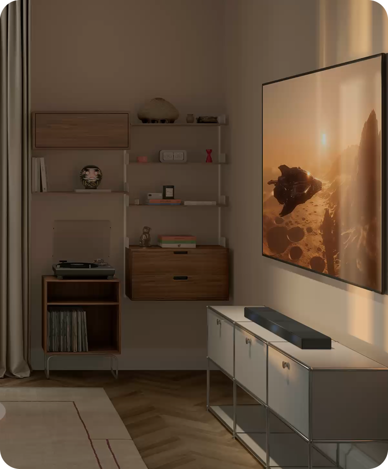
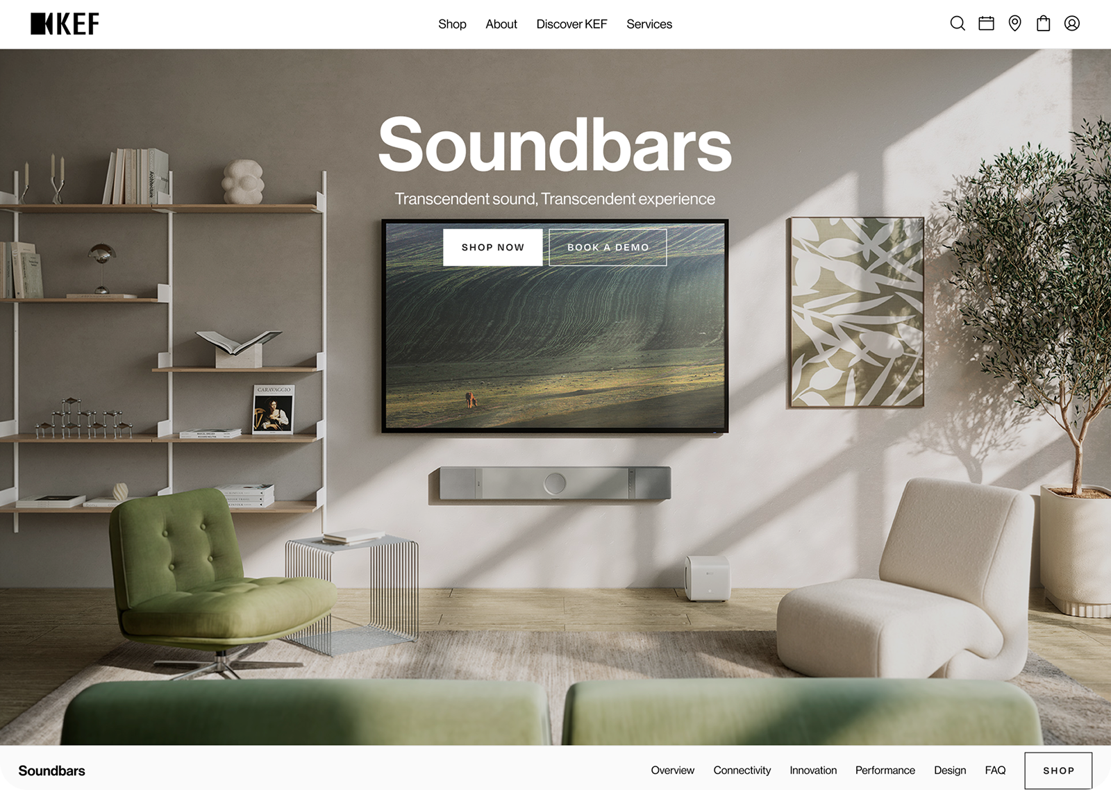
The XIO Soundbar is a brand-new product line from KEF, a compact, high-performance soundbar crafted for the users. Therefore, a dedicated landing page is needed to introduce to the public. Unlike standard PDP’s,
this campaign page aimed to build initial interest, tell a compelling product story, and shape the identity of the new line, while also guiding users to explore the PDP or even make a purchase.

One of the biggest constraints in this project was the resources. The original proposed vision included more interactions and rich content sections, but we had to pare things down. Balancing storytelling with performance was key, and we had to be intentional about what to keep, simplify, or let go. It became an exercise in focus, clarity, and doing more with less.
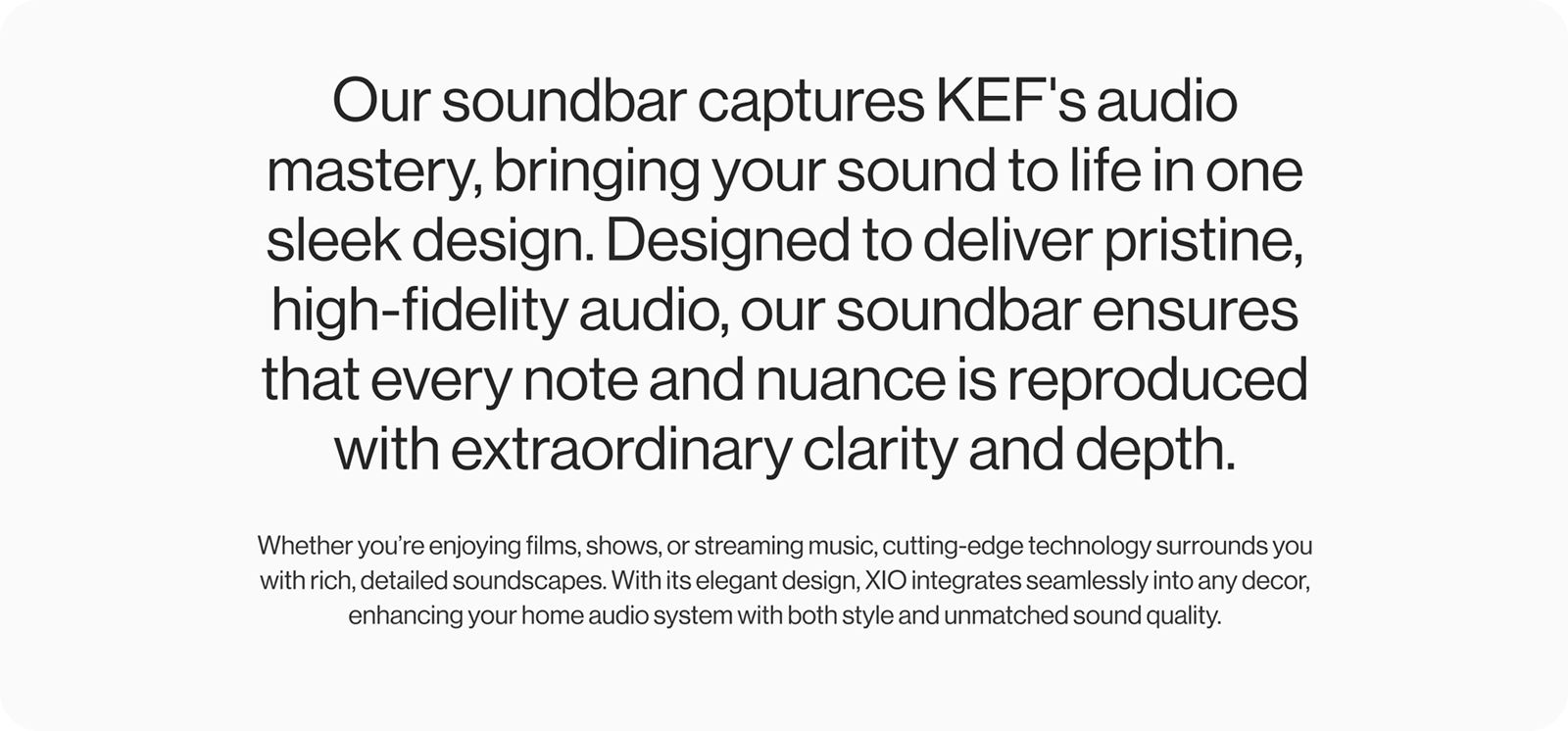
This meant making every element count and designing a simple, clear story that could still deliver impact within the limitations.
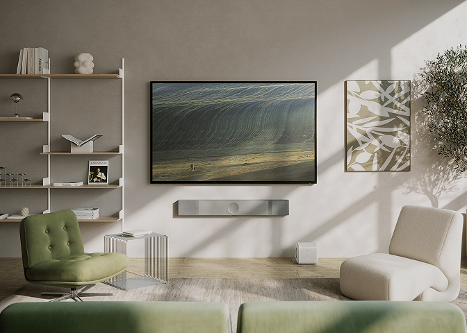
The first step was always to understand the user. How they browse, scroll, and interact with similar pages on the kef.com site. So, I gathered insights using Crazy Egg heatmaps, scroll maps, and click data, which helped shape a flow that would feel natural yet engaging. I also took references from KEF’s competitor campaigns to evaluate how storytelling, visuals, and CTAs were handled.
From there, I planned the content structure to build awareness, introduce the product’s highlights, and gently push users toward the PDP. We initially explored more expressive visual storytelling, but over time and multiple discussions, the scope was simplified to keep things lean and focused.
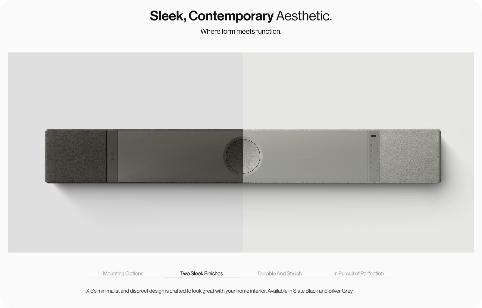
The direction evolved into something minimal but intentional, built on real behavior insights rather than assumptions. While the visual tone stayed premium, the layout became more straightforward to ensure clarity and faster load times.
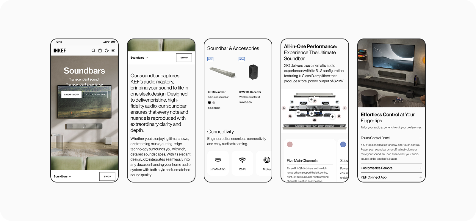
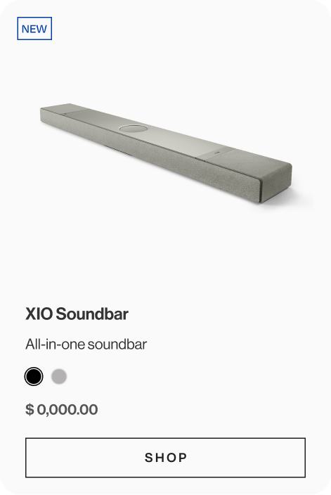
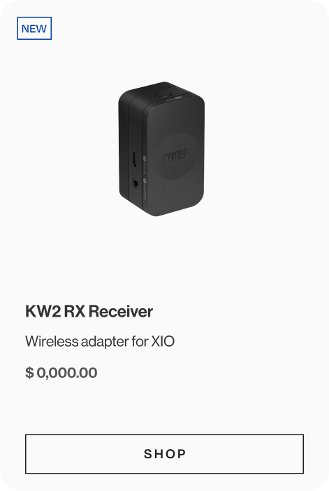
The product cards
_
_
Leading to the product detail page with the ‘Shop’ CTA.

Despite the trimmed-down scope, the final page managed to deliver a clean and focused experience. It keeps the user journey short and purposeful, with clear content blocks and a strong PDP call-to-action. While we couldn’t implement every feature and interaction we hoped for, the result still able to stay aligned with the campaign’s goal.
13,348+
Total Page Traffic (After page launched in Less than a month)
The simplicity of the layout helped boost page clarity and performance, especially for mobile users. And by keeping only the essentials, we were able to tell a compelling story without overwhelming the audience — a small but meaningful win within tight constraints.